Primal Kitchen: Website Redesign
I implemented a scalable design system that translated design components into reusable, production-ready code—giving the site flexibility, consistency, and long-term maintainability. Core experiences like the cart drawer and primary navigation were rebuilt and optimized, while only essential third-party apps were migrated to keep performance lean and intentional.

Challenges
The project had an aggressive 10-week development timeline, which required careful prioritization and highly efficient workflows.
I also needed to strike a balance between introducing a modernized visual system and preserving brand familiarity, while ensuring the site met accessibility standards.
On the technical side, both the cart drawer and the bundle builder required significant refactors to improve usability, performance, and extensibility without disrupting existing business logic.
Results
The redesign delivered measurable improvements across both conversion and engagement metrics. Purchase conversion rate increased by 6%, while total purchase revenue grew by 33%. Average purchase revenue per active user rose by 40%, indicating not just higher traffic efficiency but stronger downstream monetization.
Beyond revenue, the platform also showed meaningful gains in user quality and retention. First-time purchases increased by 16%, and engaged sessions grew by 43%, signaling that the new system improved clarity, usability, and overall user experience.
Together, these results validated the redesign as more than a visual refresh establishing a modern, high-performing platform engineered to support both immediate business outcomes and long-term brand growth.
Development Innovation
To support scalability, I introduced a modular architecture centered around a single text-block component that now powers roughly 90% of the site’s text-based sections.
This approach allowed for consistent typography, spacing, and responsive behavior across the entire site, while dramatically reducing maintenance overhead. Instead of managing O(n) updates across multiple templates and components, I reduced the complexity to O(1) by consolidating changes into a single, reusable source of truth.
The result was faster iteration, safer updates, and a system that scales cleanly as new pages and features are added.
<div
  class="section-heading__inner section-heading__inner--desktop-{{ alignment_desktop }} section-heading__inner--mobile-{{ alignment_mobile }}"
>
  {% if kicker != blank or kicker_rating != blank %}
  <div class="section-heading__kicker text-lg">
    {% if kicker_type == 'rating' and kicker_rating != blank %}
    <div class="section-heading__kicker-stars-wrapper">
      {% render 'icon-star' %}

      <span class="section-heading__kicker-rating-label"
        >{{ kicker_rating }}</span
      >
    </div>
    {% endif %} {% if kicker != blank %}
    <span>{{ kicker }}</span>
    {% endif %}
  </div>
  {% endif %} {% if heading_image != blank %}
  <div class="section-heading__image">
    {{ heading_image | image_url: width: 1562 | image_tag: loading: loading,
    fetchpriority: fetchpriority }}
  </div>

  {% elsif heading != blank %} {% assign heading_class =
  'section-heading__heading text-' | append: heading_size %} {% if section.index
  == 1 %}
  <h1 class="{{ heading_class }}">{{ heading }}</h1>
  {% else %}
  <div class="{{ heading_class }}">{{ heading }}</div>
  {% endif %} {% endif %} {% if description != blank %}
  <div class="section-heading__description text-{{ description_size }}">
    {{ description }}
  </div>
  {% endif %}
</div>
Example: Section-level usage of the shared text rendering system
{% liquid
	assign ss = section.settings
	assign kicker_type = ss.kicker_type
	assign kicker = ss.kicker
	assign kicker_rating = ss.kicker_rating
	assign heading = ss.heading
	assign heading_size = ss.heading_size
	assign description = ss.description
%}

{% render 'section-heading'
	, alignment_mobile: 'center'
	, kicker_type: kicker_type
	, kicker: kicker
	, kicker_rating: kicker_rating
	, heading: heading
	, heading_size: heading_size
	, description: description
%}
Key Charactetisics
- Semantic control is explicit, not inferred
- Variants map directly to design tokens (font-size, weight, line-height)
- No inline styles — all presentation flows through the design system
- Composable across sections, blocks, and dynamic content sources
Kitchen Sink System
To manage the wide range of content types and layout variations required by Primal Kitchen, I worked closely with the design team to formalize a design system in Figma that was intentionally structured for translation into code.
Rather than designing one-off page compositions, I guided the team toward building tokenized, composable components—with clearly defined variants, spacing rules, and content constraints—so each design decision could map directly to a reusable frontend abstraction.
These Figma components became the blueprint for a dynamic “kitchen sink” system on the site: a centralized, code-driven source of truth where every layout, text block, and content pattern could be composed, previewed, and reused across templates. This allowed the website to scale new pages and use cases without introducing bespoke layouts or duplicative logic, while keeping design and development tightly aligned.
{% for scheme in settings.color_schemes -%}
	{% #theme-check-disable UndefinedObject %}
	{% assign scheme_classes = scheme_classes | append: ', .color-' | append: scheme.id %}
	{% #theme-check-enable UndefinedObject %}

	{% if forloop.index == 1 -%}
		:root,
	{%- endif %}
	.color-{{ scheme.id }} {
		--color-tagline: {{ scheme.settings.color_tagline }};
		--color-heading: {{ scheme.settings.color_heading }};
		--color-paragraph: {{ scheme.settings.color_paragraph }};
		--color-paragraph-50: {{ scheme.settings.color_paragraph | color_modify: 'alpha', 0.5 }};
		--color-caption: {{ scheme.settings.color_caption }};
		--color-media-bg: {{ scheme.settings.color_media_bg }};
		--color-media-overlay: rgba({{ scheme.settings.color_media_overlay.red }}, {{ scheme.settings.color_media_overlay.green }}, {{ scheme.settings.color_media_overlay.blue }}, 0.3);
		--color-page-overlay: rgba({{ scheme.settings.color_page_overlay.red }}, {{ scheme.settings.color_page_overlay.green }}, {{ scheme.settings.color_page_overlay.blue }}, 0.5);
		--color-surface: {{ scheme.settings.color_surface }};
		--color-surface-light: {{ scheme.settings.color_surface_light }};
		--color-icon: {{ scheme.settings.color_icon }};
		--color-icon-30: {{ scheme.settings.color_icon |  color_modify: 'alpha', 0.3 }};
		--color-button: {{ scheme.settings.color_button }};
		--color-button-text: {{ scheme.settings.color_button_text }};
		--color-button-hover: {{ scheme.settings.color_button_hover }};
		--color-button-hover-text: {{ scheme.settings.color_button_hover_text }};
		--color-button-secondary-text: {{ scheme.settings.color_button_secondary_text }};
		--color-button-secondary-hover: {{ scheme.settings.color_button_secondary_hover }};
		--color-button-secondary-hover-text: {{ scheme.settings.color_button_secondary_hover_text }};
		--color-accent: {{ scheme.settings.color_accent }};
		--color-on-accent: {{ scheme.settings.color_on_accent }};
		--color-lines: {{ scheme.settings.color_lines }};
		--color-stars: {{ scheme.settings.color_stars }};
		--color-text-white: {{ scheme.settings.color_text_white }};
	}
{% endfor %}

Color System
Each color was abstracted into CSS variables scoped to a specific theme class, allowing for easy application of different color schemes across the site.
/* colors.css */
:root {
  --color-avocado-leaf-300: #0f4034;
  --color-avocado-leaf-200: #0f463e;
  --color-avocado-leaf-100: #047160;

  --color-pk-green-300: #84bd00;
  --color-pk-green-200: #a5cf46;
  --color-pk-green-100: #ddfd87;
  --color-pk-green-50: #d5e1af;

  --color-buffalo-sauce-300: #c65500;
  --color-buffalo-sauce-200: #e8741e;

  --color-natural-green: #b6d076;
  --color-natural-green-50: rgb(182, 208, 118, 0.5);
  --color-natural-yellow: #f4e260;
  --color-natural-orange: #f09b4a;
  --color-natural-red: #d7404f;
  --color-natural-red-50: rgb(215, 64, 79, 0.5);
  --color-natural-purple: #b268aa;
  --color-natural-blue: #91abc2;

  --color-mayo-300: #eee7ce;
  --color-mayo-200: #f3f1e8;
  --color-mayo-100: #fefefb;

  --color-grey-600: #6d7874;
  --color-grey-500: #87938f;
  --color-grey-400: #cac9be;
  --color-grey-300: rgba(35, 40, 38, 0.5);
  --color-grey-200: rgba(35, 40, 38, 0.3);
  --color-grey-100: #f8f8f8;
}

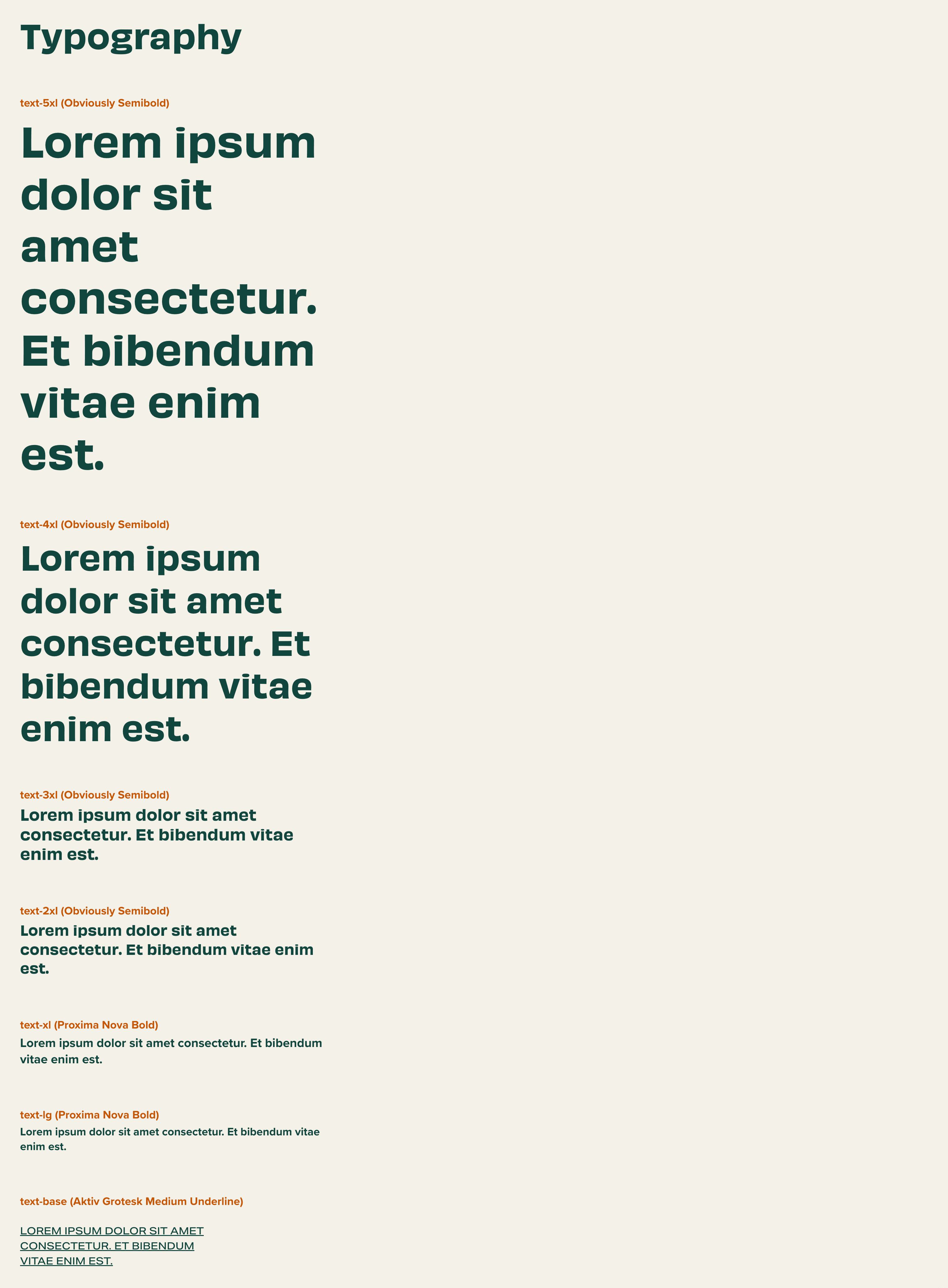
Typography System
The key innovation was consolidating all typographic concerns into a single-line CSS definition per text variant, encapsulating responsive font sizing (desktop and mobile), font weight, line height, font family, and letter spacing in one declarative rule.
/* typography.css */
:root {
  /* Dawn Overrides */
  --font-heading-family: 'obviously', sans-serif;
  --font-body-family: 'proxima-nova', sans-serif;
  --font-label-family: 'aktiv-grotesk-extended', sans-serif;

  /*Font weights*/
  --font-weight-regular: 400;
  --font-weight-medium: 500;
  --font-weight-semibold: 600;
  --font-weight-bold: 700;

  /* 1rem = 10px as set for html */
  /* Headings */
  --font-5xl: var(--font-weight-semibold) clamp(3.2rem, 6vw, 6.4rem) /
    clamp(4.16rem, 6vw, 8.3rem) var(--font-heading-family);
  --font-4xl: var(--font-weight-semibold) clamp(2.8rem, 5vw, 5.2rem) /
    clamp(3.64rem, 5vw, 6.8rem) var(--font-heading-family);
  --font-3xl: var(--font-weight-semibold) clamp(2.2rem, 3vw, 2.4rem) /
    clamp(2.86rem, 3vw, 3.12rem) var(--font-heading-family);
  --font-2xl: var(--font-weight-semibold) clamp(1.8rem, 2vw, 2.2rem) /
    clamp(2.7rem, 2vw, 3.3rem) var(--font-heading-family);
  --font-xl: var(--font-weight-bold) clamp(1.8rem, 2vw, 2rem) /
    clamp(2.34rem, 2vw, 2.6rem) var(--font-body-family);
  --font-lg: var(--font-weight-bold) clamp(1.6rem, 2vw, 1.8rem) /
    clamp(2.08rem, 2vw, 2.34rem) var(--font-body-family);

  /* Labels */
  --font-label-base: var(--font-weight-medium) 1.6rem / 2.4rem
    var(--font-label-family);
  --font-label-sm: clamp(1.3rem, 2vw, 1.4rem) / 2.1rem var(--font-label-family);
  --font-label-xs: var(--font-weight-semibold) 1.3rem / 1.95rem
    var(--font-label-family);

  /* Base */
  --font-base: var(--font-weight-medium) clamp(1.5rem, 2vw, 1.6rem) /
    clamp(2.25rem, 2vw, 2.4rem) var(--font-body-family);
  --font-sm: 1.4rem / 2.1rem var(--font-body-family);
  --font-xs: 1.2rem / 1.8rem var(--font-body-family);
  --font-xxs: var(--font-weight-bold) 1rem / 1 var(--font-body-family);
}